Seeing as I had some mild success with Hero Complex Gallery’s ‘Sketch Cards 4’, I decided I’d try my hand at their next installment aptly titled ‘Sketch Cards 5’*. This time however, I was much more prepared…or so I thought.
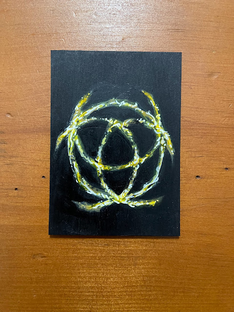 |
| "Godrick's Great Rune" |
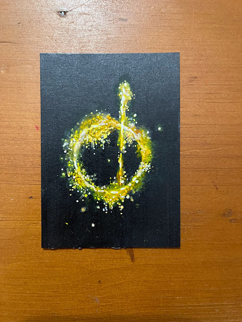 |
| "Great Rune of the Unborn" |
In my last bungling attempt, I had used all of the 5” x 5” cards leaving me with nothing but the standard 2.5” x 3.5”. I was prepared to overcome this daunting task, but I was really concerned if I had enough space to do really…anything. I’ve seen what people can do with these cards so I know what’s possible, but can I pull it off? Only one way to find out, right?
 |
| "Radahn's Great Rune" |
 |
| "Rykard's Great Rune" |
 |
| "Morgott's Great Rune" |
I began by trying to come up with a theme for my cards. A series, or thread that connected them all to one another, yet still uniquely different. I had just finished watching Amazon’s ‘The Boys’, and I really enjoyed it, so I began coming up with concepts for possible cards. The only problem? Size. What I wanted to do just wasn’t going to work with these tiny @$& cards. Thankfully, inspiration struck in the form of a video game…‘Elden Ring’.
 |
| "Mohg's Great Rune" |
So I’m a little late to the party on FromSoftware’s ‘Souls’ franchise as they are notoriously punishing games, and I like to play games, but not if they make me throw my controller down in an epic rage quit. I did however receive a copy of their George R.R. Martin & Souls love-child ‘Elden Ring’ as a present. I had been playing the game off and on for several months (I’m a busy person) and noticed that the design work was beautifully elaborate. I can identify when care has been put into design, and this was one of those times. Every item in the inventory comes with an eloquent backstory or haunting description. The ‘Great Runes’ I took particular notice of as each one is part of a shattered larger symbol mysteriously referred to as, the ‘Elden Ring’. Most ‘Great Runes’ have a similar circular shape, varying only in color, and placement of certain intersecting lines (perhaps where they were individually shattered). I felt replicating these symbols would be a less arduous task than my original plan considering the spatial restrictions and began collecting the necessary reference material.
 |
| "Malenia's Great Rune" |
My biggest challenge here was that most of the content online wasn’t true to color. For instance, the imagery I collected off my own television was more vibrant than anything I could find online. In fact, most of the time the imagine I had from the web was so poor quality that making the structure out of each rune was almost impossible. I even tried more unorthodox methods like posting on reddit, but to no avail. I determined that for me to complete this project I would need to complete this game. That or collect all the ‘Great Runes’ in the game so that I had access to high quality images. When I started the project (in June), I had all but about five of the runes I needed and was confident I could gather the resources I needed before the cards were due (August 31st, 2022).
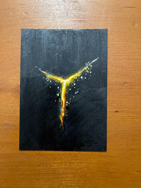 |
| "Marika's Seal" |
Casting aside the lack of reference, I started the project by painting several of the cards completely black as I would need the contrast. The black would also help in cleaning up any edges or mistakes made during the painting process and trust me there were plenty! Truth be told I wasn’t even sure this was going to work, as I feared it might warp the paper of the cards beyond use. Thankfully that was not the case, although they did warp a bit, they eventually completely flattened as I worked on them overtime.
 |
| "Rune Arc" |
With the cards primed, I let them cure overnight and then began working on them the following day. I started each ‘Great Rune’ in the same manner, by using white acrylic paint to replicate the design and shape. I bounced back between using a brush, and marker to develop each one, and then proceeded to tighten them up, by cleaning up the edges with black. I wasn’t entirely sure how successful this process was going to be as it was all very new to me, so when I started, I only did four of the ‘Great Runes’. When they turned out successfully, I began recording the process with my iPhone and uploading the timelapse videos to my social media accounts (TikTok/Instagram).
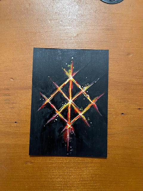 |
| "Radagon's Seal" |
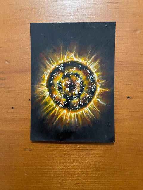
With the first step done, I then had to paint over the white base of each ‘Rune’ and replicate their appearance from the game. The first rune I tackled in this manner was ‘Rykard’s Great Rune’. I chose to start with it because it was the most vibrant and colorful of the ‘Runes’ I had reference for at the time. I also figured that if I started with the most complicated one I could determine how do-able this was going to be. I was rusty, but thankfully skilled enough to pull it off convincingly (I hope). With success on the horizon a new hope was rekindled, and I set out replicating the remaining ‘Runes’ in my possession (that is the ones I had acquired thus far in the game). Most of the replications went without event, that is, apart from the ‘Great Mending Rune of the Death-Prince’, winner for longest name, and most spatially challenged of all the runes. Its design is beautifully obnoxious, and I had to reorientate the layout of the card in order to (fail to) accommodate it (yet again).
 |
| "Great Mending Rune of the Death-Prince" |
 |
| "Great Mending Rune of Perfect Order" |
 |
| "Great Mending Rune of the Fell Curse" |
I started these sketch cards on July 26th, and completed the set on August 28th, 2022 spending varying amounts of time on each illustration. As stated above, each card was a two-step process, first designed in white, and then rendered in color. Of all the cards I did, the most laborious was definitely ‘Malenia’s Great Rune’, followed by ‘Rykard’s’, or ‘Radagon’s Seal’. The cards were due on August 31st, 2022, which I narrowly met,
*The
show has since been renamed to ‘Mini Masterpieces’ and
opened on April 29th, 2023. All of cards measure in at
2.5” x 3.5”, are one of a kind, and exclusively available at Hero Complex Gallery. Please check the gallery’s
website for availability and any other remaining works related to the show
including mine.
For more information, or to see a catalog of my other work, please visit my online store here. You can also find me on various social media platforms below doing a multitude of other artistic things that include hand lettering, and the occasional sculpting, crafting or painting.
Website: www.michaelstiles.com
Etsy: Stiles of Art
Threadless: mistiles
LinkedIN: Michael Stiles
IG: stiles1978
TikTok: stiles1978
Pinterest: Michael Stiles
Tumblr: stiles1978
Twitter: stiles_of_art


.jpg)
1.jpg)
