Sunday, November 29, 2020

Mallrats 25th: Anniversary Stinkplam Edition


When I first read the prompt for Gallery 1988’s ‘Mallrats 25th Anniversary Show’, I was perplexed as to how I was going to tackle one of my all time favorite movies by legendary writer and director, Kevin Smith.

It spoke to me generationaly, as I was a late 90’s teen, and used to visit the local mall in my city regularly.

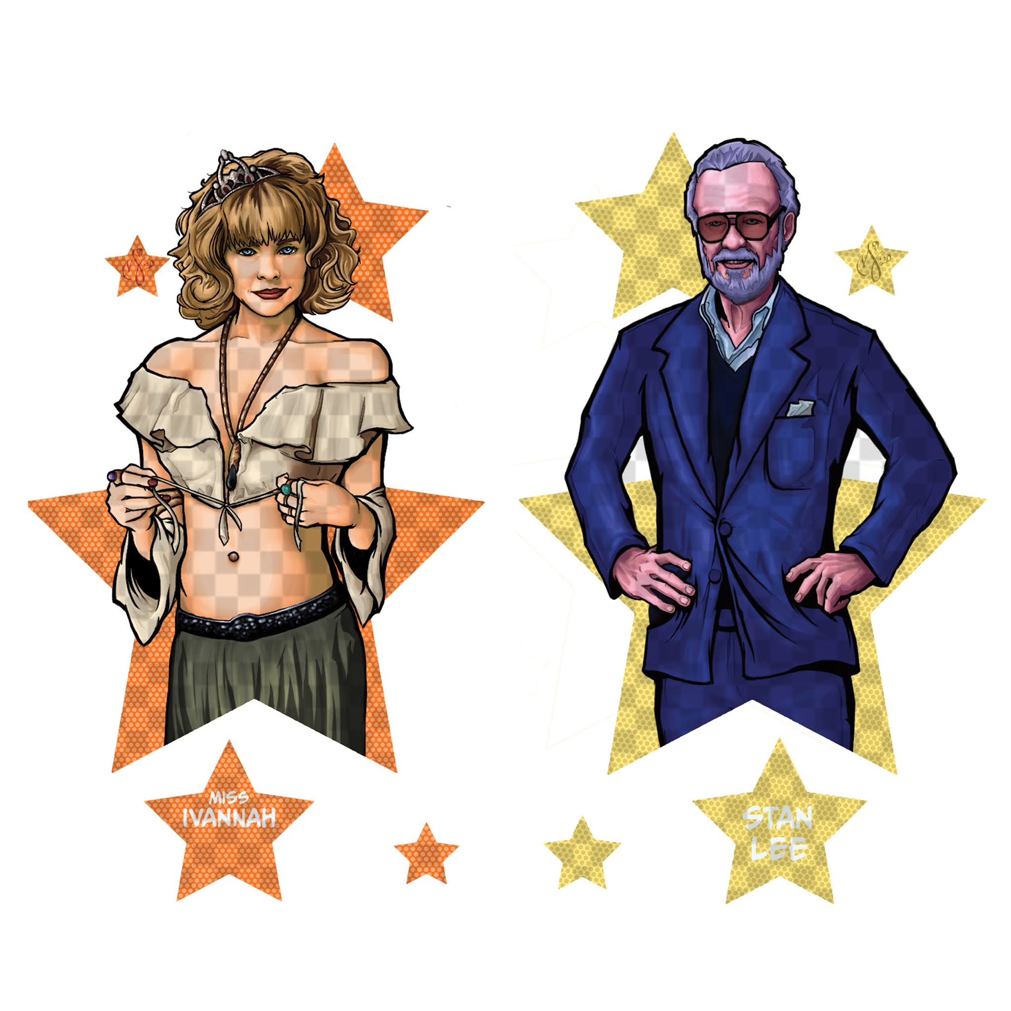
It has one of the most varied cast members, with careers spanning from film to television (like Priscilla Barnes, Shannon Doherty, Ben Affleck, and even comic book legend Stan Lee).


My goal for this project was to do something functional.

So much art is hung on walls to collect dust, so I wanted to create something that people could use.

My initial idea was to do a board game, and it wasn’t a very original concept, but I decided to pursue it hoping inspiration would carry me through.

I watched the film, gathered reference, and my idea started to take form.

I began sketching the mall layout, and wanted to configure it in the most genuine way possible.

I wanted to include all the ‘details’, but also wanted to adhere to the films continuity of events.

I researched game boards, and settled on a hybrid version of ‘Candyland’, and ‘Chutes and Ladders’, from my childhood.

Once I had a layout, I realized that my desire to maintain the continuity, and design were in conflict.

That’s when I had a new idea.


Cards.

What about a card game instead of board game?

I knew it needed to be simple, but also had a desire to base it off of the game Uno.

It was one of my childhood favorites.

I continued to mull over the concept, when it just clicked.

Simple, childhood, card game…what about ‘Old Maid’?

I LOVED the game as a child, and it also had illustrations of different characters, which I could substitute with actors from the film.

I also realized I could use the ‘stinkpalm’, from the film as my ‘Old Maid’.

Thus ‘Mallrats: 25th Anniversary Stinkplam Edition’ was born.

I started by listing all the major, and even minor roles in the film, as the cast while varied, wasn’t large in number.

I did my best to capture all the amazing actors in the film, and if I left any out, I apologize, but the clock was ticking.

I set about gathering some templates from the websites of many card game printers, looked for ‘standard sizes’ to utilize for my design.

I also needed a way to ‘frame’ my illustrations on the cards.

The characters were going to be different, but they needed to match in some way.

I thought about the Uno cards, and what drew me to them as my initial design concept.

They were colorful, and had different shapes.

I then determined, that I could frame each illustration within a collage of shapes, some organic, and others more abstract.

I also wanted to make ‘connections’ between some of the characters in the film, since it was essentially a love story. 

I concluded, that I could flip the designs I was using to frame the illustrations, and change their color based on the characters ‘personality’ depicted in the film.


I spent several days working on the illustrations, and struggled to capture their likeness, as well as the actor’s nuanced performance.

I also included a few ‘Easter Eggs’, in each illustration that pertained to the story, or that character’s role.

Eventually I somehow managed to finish all the images in record time (for me).

There was still something missing from the finished designs though.

Now the film, while loosely a love story, has also been injected with Smith’s love of comic books, and, as mentioned earlier, even has a cameo from Stan Lee himself.

With this in mind, I did a bit of experimenting with the images.

I didn’t want to alter the illustrations any further, so instead I opted to adjust the framing shapes they live within.

I ran a textured brush over the colored frames that mimicked the ‘Ben-Day Dots’, from comics of yore.

Fully satisfied, I was ready to proof the images before sending them to a printer.

After a few batches of proofs, and some OCD level editing in Photoshop, I was ready to locate a printer, preferably one who did high quality work.

I wanted to make sure these things were pristine.

That’s when I recalled a conversation with another artist, who recommended (although not used personally), a printer (Shuffled Ink), who specialized in card games.

With my deadline looming, I contacted Shuffled Ink, asking if they could meet my fast approaching deadline.


Thankfully they were able to accommodate me, and I got them just in time for the show.

The work they did was amazing, and I was so proud of myself for accomplishing this feat.

Why?

Full disclosure:

I was not familiar with the process of printing cards, as I have experience dealing primarily in prints…this gave me anxiety.

I didn’t know anyone with experience designing/printing cards, and that gave me anxiety.

I had very little time before the work was due at the gallery, and this gave me anxiety.

I got ambitious, and frantically worked myself to the bone, which also gave me, yup...anxiety.

It was a mental and sometimes physical struggle, hence the anxiety, and extreme neck pain as a result.

Despite all of this, it was worth it.

Why?

It was a success.


I was really excited about this show, as there were whispers during the initial planning stages that Kevin Smith himself, was going to be present at the opening.

The physical opening, however, was cancelled because of the pandemic. 

I’ll be honest, I pretty bummed, especially since I was really looking forward to possibly snapping a selfie with Kevin, as he’s been known to be a really cool guy.

I always miss him at any conventions I attend, since I’m typically table bound, so I can never do the meet and greets.


That being said, Kevin is a real hero, and did not disappoint his fans.

The gallery sent out an email letting the contributors know, that the show was going to be physically installed, and they were planning an Instagram Live feed of the reception with Kevin himself.

Each piece in the show was introduced to Kevin, and it was really great to see the person who inspired your work, appreciate it in person.

That was a real gift.


This project is also the first one I have ever completed, solely on my iPad, in Procreate.

The illustrations are entirely digital, with some editing done in Photoshop during the printing process.


The show originally ran at Gallery 1988 from September 25th – October 10th 2020, my cards, along with the rest of the shows collaborative pieces, are all featured on the gallery’s website.


For more information, or to see a catalog of my other work, please visit my online store here.

You can also find me on various social media platforms below doing a multitude of other artistic things that include hand lettering, and the occasional sculpting/crafting.

IG:  stiles1978

Tumblr:  stiles1978

Twitter:  paragonofpuns

Pinterest: Stiles of Art

Sunday, November 15, 2020

Walley World (Souvenir Mug)

I had literally just finished my ‘Mallrats’ cards (which you can read about here), when I had to start my next project for a show (Quest for Fun), based on the ‘National Lampoon’sVacation’ franchise.

The show was to debut at Gallery 1988 in a few weeks, so I needed to start working ASAP.

Much like the ‘Mallrats’ exhibition, I wanted my contribution to be once again, functional.

I had decided, early on, that I was going to do some kind of souvenir item from one of the films.

Each installment in the franchise revolves the Griswold’s, as they navigate many new, and sometimes foreign, experiences during their travels.

The films primarily star both Chevy Chase (Clark Griswold), and Beverly D’Angelo (Ellen Griswold), as the head of the beloved family, with cameo’s from other familiar faces.


I had a hard time settling on a film to base my piece on, as my favorite exploits take place during ‘European Vacation’, the second film in the franchise.

Since my time was limited, I decided the most logical approach was to design a souvenir from the fictitious theme park of ‘Walley World’ in the first film.

Originally, I planned to do a keychain of some kind, which evolved into a bottle opener, then a felt pennant, and finally a souvenir mug.

The deciding factor for me however, was the production time.

I could design something simple relatively quickly, but I had no control over how long it was going to take for a distributor to manufacture my product in the time remaining.

If time was not an issue, I probably would have picked the pennant, unless I could’ve come up with a concept for the bottle opener I preferred.


Since I had experience with designing mug wraps (here and here), I had a reliable, and consistent manufacturer for the mugs, so I knew what to expect.

Now usually when I do these types of designs, I like to try and linearly capture the subject, story, etc., in a way that is faithful to the original content.

Initially, I was going to illustrate the family’s travels from their home in Chicago, as they traipse through rural America in the early 1980’s, on their way to the fabled amusement park in California.

I began sketching out my idea, and gathering resource materials, when I realized that this particular approach was not ‘right’, for what I wanted to convey.

I should mention here, that as a native of Southern California, and child of the 80’s, I had some personal experience to drawn upon.

This led me to recall a design from my youth on the confectionary bags from ‘Disneyland’, which contained small vignettes of attractions, and utilized a limited color scheme.

It was exactly what I needed as a reference, if I could find it.

I then scoured the internet looking for authentic images from theme parks and their merchandise, during the year in which the film takes place (1983).

I eventually found the original inspirational image, but in my search results, I resulted in procuring an even better example from Disney’s ‘Magic Kingdom’ in Florida during the same era.


With a direction to proceed in, I began selecting my color palette for the project, based on what I thought best related to the family, and the 1980’s.

I considered that, since the film takes place during the very early 1980’s, a conservative color scheme was more appropriate (as it was also closer to the late 1970’s), and I wanted to avoid the bright, obnoxious pastels, which afflict most designs from the decade.

Once I settled on my swatches (which were selected from the pantones provided), I needed to move onto building the imagery that would appear on the mug itself.


In order to capture ‘Walley World’ as faithfully as possible from the film, I had to once again gather resource material.

It took quite some time to find some of the images, primarily because in the film, many of them are part of a matte painting dropped over an actual existing theme park façade, in Southern California.

In the movie, the theme park set is actually none other than ‘Six Flags Magic Mountain’, in Valencia, California.

Many of the rides on display either do not exist at the actual park, have been removed, or redesigned.

I had to dig through archives on many sites dedicated to amusement park history, and ride catalogs.

The four armed bucket ride in particular was a nightmare to find reference for, and you’d think after how long it took to find it, I’d remember what it was called.

Many of the images I found were either pixelated, making the details too small to make out.

I also had to cross reference the ‘fictitious’ images with that of the actual rides the family interacts with in the film.


Once I finally gathered all my resource material, I laid out the images according to how they appear in the film in an attempt to faithfully capture the park as the family approaches the front gates.

Utilizing my inspirational image from above I ultimately ended up making some design decisions to direct the flow of my work.


I immediately started on designing the images, working primarily in Adobe Illustrator, a very different approach than I would normally take for a project like this.

Luckily, I managed to quickly finish the designs, and spent the remaining time editing the size, and placement in until I had something that resonated with me.


I then worked on a title treatment for the mug, which I designed around the motif of a moose head, inspired by the character of ‘Walley Moose’, who’s theme park the family was attending.

I then had to hand-build the font in the logo, in order to mimic its likeness from the film.

The final touch came, when I set about adding the tree line in the background as a transitioning element throughout the design.

After a few more adjustments, I managed to create a design that had an appropriately ‘whimsical’ feel to it.


As stated previously, this project was completed entirely in Adobe Illustrator, with the exception of the tree line done in Procreate, and editing in Photoshop.


The show originally ran at Gallery 1988 from October 16th – October 31st, and the 15 ounce mugs (sold out) along with the rest of the shows collaborative pieces, are all featured on the gallery’s website.


For more information, or to see a catalog of my other work, please visit my online store here.

You can also find me on various social media platforms below doing a multitude of other artistic things that include hand lettering, and the occasional sculpting/crafting

.

IG:  stiles1978

Tumblr:  stiles1978

Twitter:  paragonofpuns

Pinterest: Stiles of Art


Monday, November 2, 2020

The Dark Crystal

I had been toying around for some time with the loose concept of a tribute piece to this childhood favorite.  Much like my Neverending Story illustration, The Dark Crystal was a project close to my heart based on the 1982 film, written/directed by the late great Jim Henson, brought to light by Frank Oz, and the visionary team of Brian & WendyFroud.  There were so many amazingly talented people who worked on this feature.  Unfortunately, like most movies during this time period, it didn’t achieve critical acclaim, or a following until much later.


As luck would have it, I was invited by Gallery 1988, to participate in their annual flagship show, Crazy 4Cult (14).  Since the status of this film had been elevated to ‘cult’, over the last few decades, I decided it was time to pull the trigger on this piece.  I was reluctant at first to even pursue this work, partly over the fact that my ‘vision’ was a bit grand, and to be honest, I wasn’t sure I was going to be able to execute it properly.  I also wanted to do the film justice, as I have seen many very talented artists of my generation create works based on the beloved film.  I wanted to do something bold, and possibly different.  I even had the perfect frame in mind for the main piece that was going to be shown in the gallery.


I immediately went into research mode, watched the film multiple times, and gathered all the necessary reference material I was going to need.  Once that was done, and I had decided on a rough layout/concept, I took on the arduous task of replicating the titular crystal from the movie.  This was possibly the most frustrating part of the entire piece.  I first designed the crystals outline in illustrator, as I wanted clean edges for how the image was going to look.  I was able to capture the shape pretty quickly, but it was the segments that alluded me.  I spent weeks trying to get them to look realistic by painting them digitally on both my iPad in Procreate, and my computer in Corel Painter.


Since I didn’t have much practice in painting fractal images, so eventually I decided a better (less maddening) strategy was to make the whole image more graphic including the crystal.   I did however tell myself, that in my free time I need practice painting fractal object digitally.  Some of the images I came across online were absolutely stunning digital masterpieces of rocks, stone, and gems.  It was all very inspiring, and a bit sobering.


Stylistically, since I had decided to go in a more graphic direction, I would need to find a vehicle to separate the illustrations in the crystal’s interior, and provide smaller vignettes.  I determined the best course of action would be to use the crystal’s segments.  Since the image was going to be mostly graphic in nature, I took my drawings into Adobe Illustrator, and retraced them using the pen tool.  I then set to work on the segments of the interior.  This helped give me a better idea of where to place my images, for the final piece.  Upon complete the vector work (on my Mac in Adobe Illustrator, and iPad in the Graphic App), I transferred the image into Photoshop, and then played with some gradients.  I made several passes, and adjustments until I finally had something I was (somewhat) satisfied with.  I also decided that at this point, it was no longer productive to continue working on this part of the image, as I had several other illustrations to still do for the interior, so it was time to move on.


I already settled on the interior images, but was struggling with their placement, as I wanted them to be placed in order of the film’s progression (much like my Neverending Story illustration).  I spent some time organizing my layout, and once I found one I liked, I was able to start the illustration process.  I then proceeded to the interior portions of the images, and began illustrating all the notable moments, characters, items, and other various icons from the film that I had selected. This took me a while, but nothing nearly as long as the weeks involved in the initial crystal design.  Given the direction I took with overall style of the image this process was a bit tedious as well, but much more enjoyable.


Once I completed the entire illustration, it was time to proof it.  I should mention here (which you can probably already determine by the image provided), that I had a very specific (purple), monochromatic color scheme that I was working with.  The problem was that due to the (self induced) size constrictions of the frame I was going to be using, the overall piece was smaller than I had intended for the level of detail included.  I made several adjustments to the contrast, brightness, even the hue and color saturation.  It was to no avail.  The most frustrating aspect of this was, these color choices were not even my first selection for the image.  My original intent was to use the colors from the film, which had cooler (purple/blue) tones at the top, and very warm (yellow/orange/pink) at the bottom.  The crystal in movie is after all hovering over a rather steamy volcanic looking bottomless pit.  I had failed in my many previous attempts when designing the initial crystal shape/segments to capture this likeness, but fortunately for me, this set back would give me another opportunity.


The process was monotonous, and had I not been so far into the project, I may have abandoned the whole thing for something much less elaborate.  I was however, at this point, determined to finish the piece, no matter how distressed I was over how the entire image was getting away from my original vision.   I wanted to challenge myself on multiple levels.  For me this was about trying to let go and embrace what was happening organically.  It was also about trying to do something different, and more ambitious.  If I do something I know I can execute easily, how am I challenging myself to grow as an artist? 


Resolved to make this work, I decided the best strategy was to simply take the illustration, and convert it to a grey scale.  My plan here was to attempt to run a gradient over the entire image using brighter colors to see if I could get the smaller vignettes to be more legible.  This also afforded me another chance to utilize my original color scheme that I had initially planned on using.  I manipulated the image a few times in Photoshop like a chemist creating a new compound, and somehow through pure sorcery I was able to get the image color corrected.  It printed out beautifully, and I couldn’t have been any happier with the image.


I was however, not yet finished.  The frame I picked out for this particular show was an oval shape.  It echoed the design of the chamber floor (link), from the film where the crystal rises.  I had a hard time finding reference for the glyphs that littered the inlay of the floor in the movie.  Eventually I came across multiple sources that allowed me to piece together the design, which I could then cross-reference with the film.  I then located a textured paint to use that was perfect for mimicking the porous floors in the castle.  I also utilized some paint to replicate the runes around the main ring adorning the floor, which houses the crystal. 


The final illustration is entirely digital, started in Graphic/Illustrator, detailed meticulously by hand in Painter, and edited painstakingly in Photoshop. The frame, and runes were done by hand in traditional methods stated above.


The piece was originally due to be featured at Gallery 1988 during their annual Crazy 4 Cult Show ('Crazy 4 Cult 14', which was scheduled to run from August 7th, through August 29th.

Unfortunately, due to the current pandemic, there would be no official public opening, and thankfully my work sold, so it is no longer available for viewing on their site.  Feel free however to check out the works of many of the other fine talented artists who contributed to the show here.


To purchase this image, or to see a catalog of my other work, please visit my online store here.

You can also find me on various social media platforms below doing a multitude of other artistic things that include hand lettering, and the occasional sculpting/crafting

.

Etsy: Stiles of Art

Threadless: mistiles

LinkedIN: Michael Stiles

IG:  stiles1978

Pinterest: Michael Stiles

Tumblr:  stiles1978

Twitter:  paragonofpuns