Sunday, February 28, 2021

Metroid

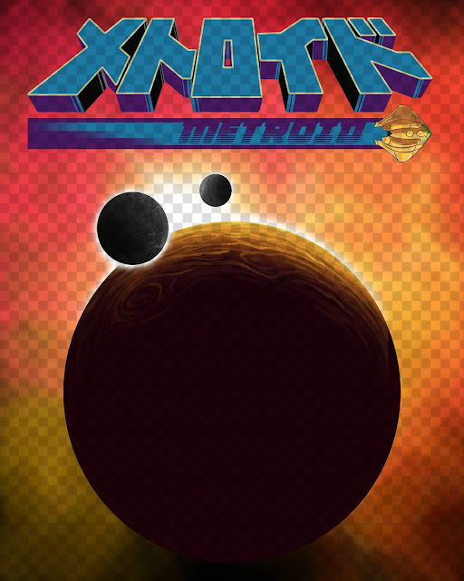
The inspiration for this project came about when I was invited to participate in Gallery 1988’s, “NES One Sheet” group show, dedicated to games from the original Nintendo Entertainment System.

I was ecstatic. 

I had the incredible good fortune to grow up during this era, so this show really spoke to me.

The only issue was what one game was I going to pick? 


The gallery requested that it be a game from the original console, so while there were plenty of games to pick, only a few of the franchises survived that generation. 

Also, my memory of the games from the period is pretty scattered.  There are only a few games I recall clearly, and those are the ones I played a multitude of times.


I mean I could do ANOTHER Zelda image, but I’m guessing that’s going to get some serious love already. I had also already done a Graphic Design project years ago based on ‘Super Mario Brothers’, and wasn’t really feeling inspired by it.  Also, I was sure it was going to be another popular choice.


The only other contenders were ‘Kid Icarus’, or maybe even ‘Mega Man’.


While I had almost narrowed it down to one of the previous mentioned games, I instead decided it might be a better opportunity to revisit a piece I did years ago dedicated to the franchise ‘Metroid’.

The work in question is not something I am particularly proud of, but it was also only done in a week’s time as part of a social media art community I was participating in at the time.

In all honestly though, the real reason I wanted a ‘redo’ on my ‘Metroid’ piece, was because it reminded me of my childhood, and was one of my first experiences playing the NES.


The game itself follows Samus Aran a bounty hunter who encounters hostile space pirates on the planet Zebes, and attempts to foil their nefarious plot to harness the parasitic life forms known as metroids.

Along her journey she encounters a few other major players, and the identity of our hero is finally revealed.

The game itself began a legacy that has a rather rabid fan base even today, spanning across most of Nintendo’s platforms in one form or another.


In addition to the subject matter, the gallery mentioned that this particular show was going to be prints only, in addition to some dimensional suggestions.

I began to do some image research for inspiration, and collected imagery from off the internet for reference.

Initially, I wanted to create new box art for the game, and set about sketching some concepts for my layout, occasionally seeking another set of eyes for feedback (thank you Kimber).

Once I was settled on my layout (pictured above), I set to work.

I knew I wanted a large title given my dimensions (16” x 20”), but also something different.

During my research I discovered that ‘Metroid’ was originally on another system of Nintendo’s in Japan, under a completely different name (Family Computer Disk System). 

I even uncovered the original box art complete with Japanese title!! 

I decided I’d use the original Japanese title for my piece with an English subtitle, as I felt it lent the image more credibility, and I always did like the original Japanese packaging over the stark American designs anyways.


I started by vectoring the title out in Adobe Illustrator, before transferring it into Photoshop, and finally into Procreate/Corel Painter.

I was initially going for an authentic vintage 1980’s movie poster feel, but eventually the piece evolved a bit beyond that, and I even found some other modern posters to inspire my direction as well.


I knew I wanted a large title at the top, and dabbled with including Samus’ visor on a very stark black background.

I also wanted to include Samus' ship somewhere on the image, as it was part of the original concept.  It thankfully worked as a way to present the English subtitle nicely, as I used the rocket boost/jetstream to hold it.

I planned on using the visor to tell part of the game’s story in the reflection for a more dramatic look.  However, as I progressed through the sketches, I realized that approach wasn’t going to work, and I needed more imagery to fill the negative space.

I was using the original Alien movie poster as a source of inspiration, as I wanted to portray the isolation, and desolate feel of the game’s atmosphere.

Eventually I decided to use the planet Zebes as my main focal point, and include it into my composition with the title looming over it.

I did a little research and found some image reference from various installments of the game, and used the to design the planet, including it’s two satellites.

I then created an atmospheric background to simulate space, and a strong contrast with a bright star cresting between the orbs.


In terms of mood or color, I felt a strong connection to warm tones, as opposed to the perhaps clichéd cooler colors associated with space.

With the strong contrast I had established, I could use the interior of the planet to house some other images, including Samus, and perhaps the metroids.


I was about 75% done with the illustration when I had to take a step back, because it just wasn’t working.

I reassessed, the layout, and made a few adjustments.

In all honesty, it wasn’t a complete tear down, and it continued to evolve in a manner I was truly happy with.


I first ditched the interior illustrations inside the planet, reduced its size (along with the moons), and reshaped ‘Zebes’ into a ‘Metroid’.

I now had a silhouette so to speak to work with and the interior of ‘Zebes’ still contained a lot of space that I could use.

I settled on depicting one more character from the game, the infamous ‘Mother Brain’.

I did some image research and then began delicately painting ‘Mother Brain’ into the planets interior, taking care to blend and connect the planet’s ridges with her.  While I wanted to remain to true to the design of the original game, I decided to take some liberties with her.  I added an eye, and turned a few of her technical components into ‘Doc Ock’ style tentacles to make her appear more menacing.

I wanted her subtle, but to have enough contrast that she was visible, without overpowering the entire illustration.


Finally I added the reflection of ‘Samus’ in her eye, as the main character is a constant target, and I couldn’t pass up the opportunity to add more detail somewhere.

Upon completing this last part of the illustration, I began to reassess the layout a bit, moving some images around, and FINALLY settled on a satisfactory design.

The last touches it needed were credits if I wanted it to look like an actual or mock, movie poster.

I had some experience with this process, when I made my “It’s The Great Pumpkin, Charlie Brown”, for a show dedicated to movie of the same name.

Once I found the right font, and color, the image was almost complete.  I had to tweak the English subtitle a bit, and added a little bit of teal to contrast with all the warm colors in the piece.  I also wanted the subtitle to have some variations to look more like a rocket's jets propelling it across space.  I then took a bit of that same color and added it to the Japanese title to create a gradient effect.

The last task was to color proof it, before I could get a final set printed for the gallery.

I also had one more issue, and it called for expediency.

The entire aforementioned process was happening quickly, and probably would have been more focused if it wasn’t for the time constraints (hence the constant changes as inspiration shows up when it wants).


My printer was going to be closing their physical location in a manner of days, and since most of my artwork is digital in nature, obtaining proofs to color correct is a crucial step.

Luckily I was able to complete the image in time after several trips to my vendor, before they shuttered.

However, I will need either plan ahead to have my proofs mailed to me, or find a new location to use.


As mentioned above, this project was done partially in Adobe Illustrator, and then painted in Procreate, and Corel Painter.  Finally it was adjusted in Adobe Photoshop, until I was able to get a proof that was satisfactory. The image was originally designed to be printed at 16” x 20”, and was limited to a set of 35.


The show originally ran at Gallery 1988 from March 12th- 27th, featuring my work from this post, along with the rest of the shows collaborative pieces, which are available for viewing, and purchase on the gallery’s website.


For more information, or to see a catalog of my other work, please visit my online store here.

You can also find me on various social media platforms below doing a multitude of other artistic things that include hand lettering, and the occasional sculpting/crafting.

Etsy: Stiles of Art

Threadless: mistiles

LinkedIN: Michael Stiles

IG:  stiles1978

Pinterest: Michael Stiles

Tumblr:  stiles1978

Twitter:  paragonofpuns


Sunday, February 7, 2021

Wonka Bar (enamel pin)

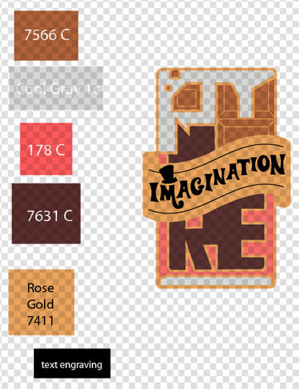
This work was inspired by the 1971 film ‘Willy Wonka & the Chocolate Factory’, starring the late great Gene Wilder.  The piece has also been repurposed from an illustration I did a few years ago from a show dedicated to the author, Roald Dahl.  For that image, I created a calligram using the framework of the Wonka Bar as portrayed in the film, and the lyrics of the song ‘Pure Imagination’ from the original score.  The song, which Wilder performs, resonated with me so deeply, that upon hearing it, I am immediately bewitched by the nostalgia it evokes.  I wanted to keep the color scheme of the Wonka Bar as close as possible to the 1971 film version, and of course had to include the elusive Golden Ticket. The story behind this particular design takes me a back a bit further than most, which you can read below.

A few years after creating the original illustration, I began to have a more active role at conventions sharing my work, and came upon the enamel pin market.  It seemed to have a rabid following, and I thought about how I might tap into it with my own work.  As I went through the catalog of my work in my head, I realized the iconic Wonka Bar might make for a proper design.  Most of my work is very detailed and colorful, so the image needed to be a bid more simplistic, just for manufacturing purposes alone.

I worked loosely on designing something based on the illustration, but shelved the project at some point.


It would continue to collect dust on my desktop until I received an invitation from Gallery 1988 to participate in their ‘50th Anniversary of Wonka’, show.  I decided this was a prime opportunity to finally finish that project, and would also give me some sense of accomplishment, because as an artist, we have a lot of what I like to call ‘orphans’ (projects that just never see the light of day or are just half finished).  I also have never done an enamel pin design, and wanted to explore the market a bit, as I intended to do years ago. 

In 2020 I had done a lot of ‘firsts’, with marketing my work into other forms besides prints. 

In a continued effort to try new things, and experiment (as artists do), why make this year any different?

 I immediately set to work using the aforementioned original design I had created as a template.  I knew I was going to have to simplify the design, and had some ideas about how I was going to reorganize the image. 

First, the lyrics would have to be ditched.  I wanted the pin itself to be around 1”, as that seemed to be the industry standard.  I also waned to retain the calligram aspect of the design itself, and determined that I could just use the title (Pure Imagination), of the titular song in question for the design, as opposed to including all the words.  It would serve the same purpose, but was going to require a bit more creative ingenuity from me.

I determined that since the frame of the bar was basically a rectangle, I could use the segments of the candy bar to make up the letters.  Thankfully, I also determined that the ‘Golden Ticket’ needed to be a focal point like in the original work, and placed the ribboned ticket centrally.  This allowed me to square off the protruding portions of the bar, making the four letters I needed to design aesthetically more symmetrical. With my layout roughly in place, and more conceptual than actually implemented, I needed to familiarize myself with the legitimate design process of making an enamel pin itself.


I turned to everyone’s favorite research tool, the internet, or more specifically, Youtube.  I had exhausted my ability to comprehend the process via text after reading non-sensical articles that began to border terminology I did not have the patience or time to decipher. Thankfully I stumbled upon Becky HolmesEnamel Pins 101:  Preparing Designs for an Enamel Pin Manufacturer”, YouTube video, so big ups to Becky!!!  This got me started, and I set to work with my newfound knowledge of pantone colors, strokes, and a nifty list of ‘things to consider’. 


I gathered what visual research I needed in addition to my previous design, and started to build the image in Adobe Illustrator.  Thankfully I have some familiarity with the program and was able to create the line work with little difficulty.  The biggest challenge was finding where some of the options I needed were buried in the platform itself (like the VERY specific pantone colors).  Once I resolved those technical issues the artwork itself took me very little time, for once.   The only thing I was missing was font for the ‘Golden Ticket’, for the words ‘imagination’ to complete the design.  I determined that at this point, with the design somewhat finalized, I should find an affiliate; get a quote, and an estimate how long manufacturing was going to take. 


I took to the Internet again, and tracked down a designer that I was going to use for an unrelated enamel pin design that never came to fruition for a charity I was doing.  I’m not sure how I came by their contact information, it could have been from a friend, recommendation, or I may have taken their card during one of the many conventions I had done over the last few years.  I located their site, Alchemy Merch, and did all the reading they had provided for file preparation of design work submitted.  It took me a bit of time to wrap my head around the measurements, partly due to the fact that most (if not all), enamel pin manufacturers are overseas, and work in metric measurements.  Also, Adobe Illustrator’s measurements are in points, a measurement I am largely unfamiliar with, and perhaps more pixel-based than tangibly quantifiable.  I contacted the manufacturer using their online form with my list of questions and concerns, including my quasi-completed design for review.  My primary issue was the conversion of points to mm, as I wanted an accurate depiction on my computer screen so I knew exactly how to scale, or edit my design.


I received a response the following day from Alex, and after several correspondences, was able to finalize my design.  I was however unbeknownst to me, also working against a tighter deadline than I realized, due in part to the understandably slow shipping impacted by the pandemic. Alex informed me that the usual two-week turn around was actually going to be closer to four.  I knew the process was going to take time, so I thought I had given myself ample leeway this time, unlike the previous shows where I was working down to the wire and had to (expensively) expedite my projects.  Given this information, it looked like the pins would arrive almost the same week as the gallery’s deadline.  I contacted the gallery, and thankfully they were accommodating.


I also still had to finish the font for the ‘Golden Ticket’.  I scoured the internet for a font that I thought worked best, and found a typeset inspired from the film’s title treatment.  I set about creating my own letters in Adobe Illustrator to adorn the ticket, using the typeset as inspiration.  Upon completing it, it still lacked the whimsical feel from the film, so I included the iconic hat ‘Wonka’ wears in the film as an accent similar to the branded chocolates produced by Nestle.


Happy with final design, I submitted the file, paid my invoice, and said a prayer to whoever was listening that these pins would arrive on time for the show.  It was a gamble; especially considering that the timeframe I was given from the manufacturer was even longer than they quoted by almost two weeks.  The pins were slated for arrival as early as the 1st week of February, to the week of the actual show itself on the 16th.


TO BE CONTINUED….


In the next paragraph that is!

I jokingly told myself, and others that whether or not the pins arrived on time was in ‘God’s hands now’, rather dramatically.

With so much taking place in the world, I decided to simply hope it would arrive on time, and moved on.

Thankfully, they did in fact show up, and much earlier than anticipated, or quoted.

I first received an email from Alex at Alchemy, that my pins were done, and on their way to my mailing address in the later part of January.

I received them shortly after, before the month’s end, and was really happy with the design. 

The company did a great job, and I emailed Alex to thank him for his help and patience.

I was also able to drop them off at the Gallery EARLY for once, which was a relief. 


The final product itself, is approximately 1.1” x .75”, and was designed entirely in Adobe Illustrator, with the pantone color selection process done in Adobe Photoshop. Alchemy Merch fabricated the mold, and their overseas affiliate fulfilled the final production requirements.  


The piece is to be featured at Gallery 1988 during their ‘50th Anniversary of Wonka', scheduled to run from February 19th to March 6th, 2021.

Unfortunately, due to the current pandemic outbreak, I do not believe there will be an official opening.  The work along with the rest of the shows collaborative pieces, will be featured on the gallery’s website.

For more information, or to see a catalog of my other work, please visit my online store here.

You can also find me on various social media platforms below doing a multitude of other artistic things that include hand lettering, and the occasional sculpting/crafting

.

Etsy: Stiles of Art

Threadless: mistiles

LinkedIN: Michael Stiles

IG:  stiles1978

Pinterest: Michael Stiles

Tumblr:  stiles1978

Twitter:  paragonofpuns