Wednesday, May 11, 2022

THE SOCIAL NETWORK

This piece is an example of throwing caution to the wind. I am not an abstract artist what-so-ever, and as a creative, I am truly embarrassed to admit that I don’t ‘get it’ very often, or ever, in most cases. With that in mind, perspective (or arguably personal taste), shouldn’t prohibit me from drawing upon these works for inspiration, right?  This would be my second venture into this ‘space’ the first in this style being my ‘These Strange Things…’ piece for the Paul Thomas Anderson show at Gallery1988 in December (2021).  Even with that piece, my work has lately started to take on more of a graphical look.  This is my ‘abstract phase’ I guess for any historians out there willing to following along, or for when they unearth some sacred treasure with a vague signature and ‘QR’ code sticker on the back. That or it’s my ‘director series’…? 

The theme for this piece, I should note before I take you on another random unrelated tour of my mind, was based around director David Fincher. Or more importantly, illustrating one of his features. I recall seeing the email and was both elated & anxious.  I love Fincher’s work.  I’ve seen most of his films and grew up watching the music videos he worked on early in his career (unknowingly).  My favorite project of his has always been ‘Se7en’I saw it in the theaters by accident, and became (healthily) obsessed with his work. I’d watch anything his name was on and was usually rewarded.  If he’s reading this, I have one request, Mr. Fincher, David if I may, please for the love of all things holy, finish ‘Mindhunter’!!!! Damn that show is intense.  I digress…

Looking over Fincher’s work I knew I shouldn’t pick anything already too saturated.  For me that meant no ‘Fight Club’or ‘Se7en’, which left me with ‘The Social Network’. Outside of ‘Mindhunter’, this had to be my most favorite recent-ish work of his.  It is such a cross section of human psyche that it haunts me how well it was done.  This however would not have been possible if it was not for the masterful and Oscar-worthiness of the entire team involved. The adaptation (of Ben Mezrich’s ‘The Accidental Billionares’), by Aaron Sorkin (>ahem<OSCAR>ahem<), the music….can we talk about the music?!!! Holy cow, also the music by Trent Reznor & Atticus Ross (>ahem<OSCAR>ahem<), which created such incredible tension, and the editing done by Kirk Baxter & Angus Wall (>ahem<OSCAR>ahem<), yeah…it was great film. It was also nominated for eight Oscars in total, but ONLY won three. So, there’s that. 


I got to work rewatching the film and collecting some reference materials for my illustration.  As usual the final images you seen here were developed over time, and it transformed at least twice before I settled on my final layout/design.  My first idea is something I may return to, so for that you’ll have to stay tuned, but I will tell you it was a quote.  The second phase I had a better idea of what I was going to do, but no clear layout, just a bunch of imagery I knew I wanted to include and it was going to look something like an old Facebook profile.  I was firm however on three things:  the color scheme, the focal point, and a design element to relate it to technology.

At this point I looked at some of my previous work and decided with at least two out of three elements nailed down (color/focal point), I should just start something.  Taking inspiration from the illustration I mentioned earlier (first paragraph…I’ll wait), I painted the background in Procreate, and the returned to my reference material. Since I was going to keep things mostly abstract and only planned on having one actual realistically rendered element, I would need to choose anything I could use as a ‘symbol’ of some kind (be it logo in the case of Sean Parker’s representation here with Napster), or even typography (with the detailing of Mark Zuckerberg’s alleged hacking for Facemash).

I finalized the layout rather quickly after determining what I was going to represent, and what was not going to make the cut.  I settled on the pint glass of beer (which originally was a Beck’s bottle as in order to true to the context of both film and alleged ‘facts’), the ‘equation’ written by Eduardo Saverin (Andrew Garfield), on Mark’s dorm window. I still needed a technological element to connect everything to fill in the dead space and as a method to convey more of the story.  I knew the bottom of the work, much like the ‘These Strange Things…’ inspired piece, would have silhouettes of iconic buildings/structures that could be easily identifiable.  

I turned to the web, which eventually led me somehow to circuitry images that I ended up using for inspiration. I then took my background into Adobe Illustrator, and began constructing the silhouetted buildings I needed for my base along with the window & circuitry.  It didn’t take me entirely too long to design all three and take it back into Procreate. Meanwhile back on the iPad I went about finishing the illustration/design, detailing the central beer glass, window (banners*), and rowers. Upon finishing I got it ready to send to SGX for proofing. (*Those banner images were hella hard to find.  The Greek letters were in the movie, but the Phoenix Club’s symbol has been almost wiped form the internet, I’m guessing because of all the controversy around these Harvard Final Club’s and their ‘sunsetting’ back in 2017).

Covid, however, was not done with supply chain and so the paper I had so diligently asked my printer to hold for me the day I started the image, was not yet available…yay… Eventually, much closer to the due date, the paper arrived, and there was one more final hiccup, because…life, amiright? After one proof, I was able to correct any ‘issues’ (being only the rowers changing in hue as they were lost in background), I got ready for my final round. I originally scaled the image to 11” x 17”, for the sole purpose of having the extra layers available on Procreate.  You see non-artist types, the larger the starting size, the less layers you have, even at an industry standard threshold (300, but really 600 IMO at least).  Thankfully, upscaling can be done in Adobe Photoshop without error. You DO NOT under any circumstances want to upscale any image or item in Procreate, it will become hideously pixelated, losing most of the detail.  Wait to do it in Photoshop or other software that has the capacity to upscale an image without destroying it. The problem here was none of that, and I’m pretty sure I’ve issued this warning before. Typically, when I get the White Pearl Linen Paper from SGX, it comes in sheets of 13” x 19”. So as not to waste any of the precious commodity, I enlarged my final image to 12” x 18”. The paper SGX had, was however, also 12” x 18”, meaning some of my image was going to be lost, AND it was not going to fit in the frame I needed it to for the show. Or at least I thought. Luckily, I was able to get things worked out (with help from my liaison at SGX), and the final image fit beautifully in the frame.  

The final illustration is hidden with ‘Easter Eggs’, entirely digital, started May 2nd and finished May 11th totaling about twenty-two (22) hours. The image was primarily developed in Procreate, with some design work done in Illustrator, and minor editing in Photoshop. What’s that? Well, I could tell you everything I ‘hid’ in this piece (another Stiles Trademark historians!!!), but I’m not going to, so either enjoy or look away, you’re ruining the ‘mystique’.

The piece (limited to a run of 11), was originally featured at Gallery 1988’s ‘Political Menace & Moral Despair A Tribute to David Fincher’, which ran from June 11th, 2022 through June 25th, 2022. The image is roughly 12” x 18”, and is printed on white pearl linen paper.  Please check the gallery’s website for all available works related to show, including mine.

For more information, or to see a catalog of my other work, please visit my online store here. You can also find me on various social media platforms below doing a multitude of other artistic things that include hand lettering, and the occasional sculpting, crafting and painting. 


Website: www.michaelstiles.com

Etsy: Stiles of Art

Threadless: mistiles

LinkedIN: Michael Stiles

IG:  stiles1978

TikTok: stiles1978

Pinterest: Michael Stiles

Tumblr:  stiles1978

Twitter: stiles_of_art

Monday, April 25, 2022

FINAL FANTASY (1987/1990)

If you know me at all, you know that I love video games (I mean I do have some other stuff in my portfolio dedicated to the medium so, there’s that, and that, you get the point). Sorry, I just do.  I honestly believe they deserve so much more appreciation than they receive, both developmentally, and artistically.  They are literally works of art, especially now.  They’ve also taken the classic clichéd and derivative trope of good versus evil, and invested some actual writing that goes beyond the abstract narrative. This is why whenever I am given the task of illustrating anything related to the genre, I JUMP at the chance. Thankfully the opportunity presented itself in the form of Gallery 1988’s ‘oNE Sheet’, a show they’ve done the last few years dedicated to the games on a broad selection of classic platforms (NES, Super NES, Genesis, & Turbo Grafx) . The only problem?  There are literally too many franchises and personal loves to pull inspiration from.  If I was given free rein to ONLY do video game covers, that would be a dream job, or at least it seems like it could be. I’ve always wanted to work in the video game industry, but sadly I lack the aptitude for programming.


I came up with a list which included close to forty titles.  I narrowed that down to fifteen finalists, and eventually a foursome leaving only: ‘Castlevania’ (which I already had a sketch for), ‘Final Fantasy’ (our winner), ‘Kid Icarus’, or ‘Secret of Mana’. I’m not sure what swayed me to towards the 1990 (’87 in Japan), classic ‘Final Fantasy’, but I went with my gut and pursued it which thankfully panned out beautifully.  This is a rare example of a layout/design I had ‘conceptualized’, come to fruition.


I started the design by first drawing inspiration from the original game box, and promotional poster.  I recall it vividly, as it’s a game, and franchise very close to my own heart.  I wanted to capture the essence of the old poster but give it a modern twist. I also wanted to keep the design very symbolic without character imagery, primarily because this first installment had no clear lead character.  The game was originally designed with only character classes to choose from with preordained avatars assigned to each one.  They could be named, but that was the extent of their customization, and your options were limited to: ‘Fighter’, ‘Thief’, ‘Black Belt’, ‘Red Mage’, ‘White Mage’, or ‘Black Mage’. You were also limited to only four party members, all available from the beginning. In relation to my design, each of the four warriors in the game, was charged with a dormant crystal corresponding to each of the four basic elements in nature (Earth, Fire, Water, Air).  The goal in the game was to find and defeat the ‘four fiends’ (‘the Lich’, ‘Kary’, ‘the Kraken’, and ‘Tiamat’), in order to bring light back to the crystals, and ultimately defeat Chaos. With that explained (hopefully clearly), since each playable character is variable depending on the gamer, the only constant I had to work with were the fiends themselves.  While I could have simply depicted each fiend, which in retrospect (like literally as I write this), sounds like a really awesome idea (variant?), I do like my works to contain more mystique.  Instead, I opted to use the locations from the game where each of the four fiends reside.  The flying fortress of ‘Tiamat’ is already well represented in the original poster/cover design, so I knew that wouldn’t work as the central figure, which sucks because I drew an amazing floating castle (IMO), rather quickly, and that airship is BEGGING to be seen at a larger scale. I ended up settling for ‘Kary’s’ volcano lair, as it had the most scenery to work with. 


I then created my ‘crystals’ in Adobe Illustrator, and eventually settled on a layout that would work with the title I was planning on adding later and the logo’s I’d need to place at the bottom.  I then began sketching in Proceate the different fiend environments based on memory and the research I did on the game.  I quickly settled on both ‘Tiamat’s’ locale, and ‘Kary’s’.  The Earth, and Water fiends, were a bit more allusive.  As I was drawing their settings I began to simply imagine what the area could look like. This was my opportunity to give these areas a redesign I realized so I took a different approach to them.  In the game, the ‘Lich’s’ Earth Cavern is within a swamp area at the base of the mountains. I went through a few variations for the ‘Lich’s’ domain, before finally settling on the current version, and notably, it’s the only fiend lair in the game accessible by foot.  The ‘Kraken’s’ Sunken Shrine was a different story though.  In the game, the temple is accessible from the third floor, and only by the barrel after some other related quests (naturally it’s an RPG).  I think with any of these, this is probably where I strayed the most from the original.  Initially I was going to do a Sunken Shrine using a Greek style structure to keep within the rather (arguably), western design of this game.  I ditched that after some thought, and figured I’d much rather design something that looked like it should be there.  I began looking at underwater images for both lighting reference, and rock/coral formations.  Eventually I settled on the final design we have here, which I think feels more appropriate.

My next task was to ink everything in, which took some time. Upon finishing, I began the color process, which for once, I had a clear plan for.  I knew I wanted to represent each crystal with a specified palette that stayed closely within a set of values (like the reds and oranges for the central volcano image).  I also planned on using their complimentary hues in order to get the images to contrast.  I had planned for this earlier, by also making sure that those scenarios, and their complimentary colored ones were distanced a bit in order to keep the eye continuously moving. There’s always a point, or aspect on an illustration will give me challenges in any given piece ranging from:  layout, design, a pose, lighting, value, contrast, even a combination of all of them, but the typical culprit is color.  Especially if I am using multiples and not just a set of values (monochromatic).  I have improved in this area greatly but I still struggle sometimes, so I was very thankful that this piece came together so vividly.


With the interiors filled, I still needed to address the title treatment, and logos at the base.  I went back to my desktop, and began designing my icons, and font in Illustrator.  I decided earlier when I began the color process to eliminate as much yellow as possible from my choices, as I had simply envisioned the title in this value.  I also didn’t want the title to compete with the rest of image, and it proved to be a good choice.  I also decided to add some subtle design elements to the crystals as they weren’t reading as glass or reflective to me. 


Having completed the image, it was still lacking something.  I took the image back into Procreate one last time and did some experimenting with the different textured brushes available on the application.  Eventually with enough tweaking, I managed to come up with what we have now.  I think it adds a bit of implied ‘magic’, that the overall illustration lacked. 


Satisfied with the work, I sent it over to SGX in order to get a proof of the image before I ordered my finals.  Thankfully, the image didn’t even need the proofing which was also just an amazing feeling.  Unfortunately, this show had some image size guidelines, or really preferences, by the gallery.  Thankfully I was able to locate an alternative printer (Costco), that could print the images ‘affordably’ at the size requested (16” x 20”). The gallery was willing to accommodate a smaller size, but I had already planned for a larger format, so it just worked out that way.  I also wasn’t planning on using any type of special material for these, as the gallery had also requested a larger number for this (very popular) show. 


The (“16 x 20”) piece is printed on high quality photo paper and was originally featured at Gallery 1988’s “oNE Sheet”, which ran from May 21st, 2022, until June 4th, 2022.  Please check the gallery’s website for all available works related to show, including mine.

For more information, or to see a catalog of my other work, please visit my online store here. You can also find me on various social media platforms below doing a multitude of other artistic things that include hand lettering, and the occasional sculpting, crafting and painting.


Website: www.michaelstiles.com

Etsy: Stiles of Art

Threadless: mistiles

LinkedIN: Michael Stiles

IG:  stiles1978

TikTok: stiles1978

Pinterest: Michael Stiles

Tumblr:  stiles1978

Twitter: stiles_of_art

Monday, March 14, 2022

COLOMBIA HAUS

This piece went through a lot of metamorphoses.  I was tasked with creating a piece that represented the 1990’s, for Gallery 1988’s show ‘The 90’s’.  These broadly themed shows are always SO much fun, but the problem is…there are just too many options.  When you combine that with the fact I admittedly came of age during this decade, it would have to be something special.  When I began this project, it was originally going to just be an illustration based on a popular movie from the 90’s. 


A typical advert of the music giant found in many popular publications during the 1990's

In an effort to explain properly point A to B, or in this case, A to like G, we need to admit that there was/were steps B though F, right? I’ll try to do this quickly because these are all just unrealized projects that also were a HUGE drain of time, BUT now, are in the ol’ toolbelt/arsenal for later, yagetme? (negative<positive ;) So A was a collage piece, with a cutesy lil’ old school computer and nostalgic stuff floating in the background. It was more like a wallpaper, and if you’ve seen the (gallery) show, it was ‘done’. B, was an illustration for the 1994 gothic fantasy ‘The Crow’, and not a bad one at that. C, was an illustration that I just could not nail down for 1994’s ‘Reality Bites’, a tale close to my own heart starring 90’s waif Winona Ryder as the clueless college graduate and Gen X Icon ‘Lelaina Pierce’. I love this movie, and one day I will get something made in its likeness, what that is, remains to be seen.  D, was another illustration, this time for the 1995 NC-17 bomb-shell…‘Showgirls’. Words cannot describe this movie. It’s so awful, yet there is just something completely magically about how campy it is. It’s 90’s opulence at its finest, and even attempts to dispense some wisdom itself. E, was a departure back into the realm of enamel pins. A place I haven’t returned to in some time. I thought about maybe instead of celebrating a film, to try to find something that was immediately recognizable as belonging to this generation. Ambitious? Yes, but also do-able. Here I designed my first of three pins.  This one was a cassette tape that my own focus group was split down the middle over.  I may still have this made, not sure, we’ll see. It was an easy design and I had so much fun making it. F, was another enamel pin design, which celebrated the ‘Blockbuster Video’ franchise, and the waning days of the VHS. G, was the design I settled on primarily because I felt it did something that my focus group might have unintentionally brought to my attention. During this time period so much changed in technology as it shifted from analog to the dawning of the digital age.  That shift caused a rapid movement through media conduits which makes it hard to pin down a physical representation like a record, cassette, CD, or what not. Eventually my sketching and internet searches led me to either recall, or perhaps come across an image for the music club Columbia House. The two words caused a fire to burn within me.


A typical insert for the franchises' 'club' recruitment

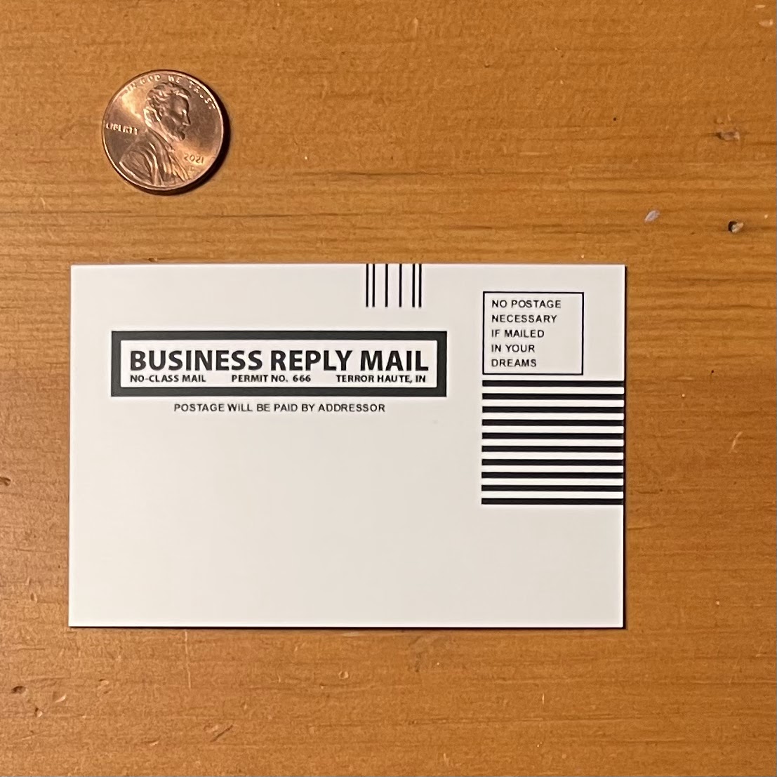
For those who never fell into the rather complicated web of ‘Columbia House’, allow me to explain (from memory) how it worked. They were a company that had leaflets or ads inside of popular magazines pandering to teens and young adults during this decade before the digital age completely decimated print media. You could almost always find a ‘Columbia House’ ad in any Rolling Stone, Spin, or other popular teen periodical. Columbia House’s approach was a slick devil’s bargain in disguise.  Here’s how the soul selling deal went: For the price of a penny ($.01), they would send you several CD’s (Compact Discs), or Cassettes, of your choosing. The problem was as part of ‘membership’ fulfillment, you were obligated to purchase at least three CD’s/Cassettes at the full retail price. Sounds easy enough, until you realize that Compact Discs while only taking a few cents to make, were selling standardly at around $20-25 each. They were ridiculous expensive at the time before music had gone digital, which is why ‘mixed tapes’, or CD’s were so popular. The other issue was Columbia House would send you a mailer with a bunch of information, one piece being a notice that you were required to send back or you’d receive, and be billed for, their ‘Selection of the Month’.  You could send the package back, but it was a hassle, and contacting the organization took an act of Congress (I should note here, that I did indeed speak with someone residing in Barbados, which outsourcing at the time was unusual, and not as much of a mainstream practice as it is today). Even if you completed your obligations, it was extremely difficult to leave their cult-like retailing. Keeping this in mind I took inspiration from the now mostly defunct company’s logo (I hear they still exist, but not in the same capacity. If you are interested about their untimely demise, their rise and fall is quite a fascinating read). The design process was simple and straightforward once I decided upon using the logo as my base for the piece.  I located a good reference, vectored my image in Adobe Illustrator, and selected my Pantone colors for the manufacturer (Alchemy Merch would I have used for another gallery project). Considering I may be skirting copyright infringement territory with the design, I wanted to make sure to alter it.  I went with the traditional 90’s defacement of things complete with red anarchist symbol that was so popular during those times. I deliberately ‘scratched off’ the ‘E’, leaving only the ‘H’, ‘U’, and ‘S’ visible. Along with the large ‘A’, it now read ‘HAUS’, and therefore gave the intended cynicism directed towards any language with lingering communist ties at the time. I added the extra words ‘sucks’, as it felt like the right thing to do for this piece, and the given era. During this timeframe it wasn’t uncommon to see logo’s, decals, pictures, communal books (text/library), all defaced with this type of ‘graffiti’ or vandalism. While it wasn’t harmless, it was also done on a much smaller, and lowkey scale, with an intent at levity. Satisfied with the design (and focus group passed), I sent the design off to the manufacturer, and began working on a backer that would properly showcase the pins. Unfortunately, the only design I could come up with was one based on the mailers from the magazines.  Taking that as my template, I made a few adjustments in Adobe Illustrator with the verbiage and had them printed with MOO on 3.5” x 2.25” backers.


The soft enamel pin, (made from black nickel) itself is approximately 3/4" (H) x 1.35" (W), each one is bagged and mounted on a backer. The pin was designed entirely in Adobe Illustrator, with the pantone color selection process done in Adobe Photoshop. The backers were designed in Adobe Illustrator as well and printed by MOO. Alchemy Merch fabricated the mold, and their overseas affiliate fulfilled the final production requirements.  


This piece was made specifically for Gallery1988’s ‘The 90’s’ which ran from April 30th - May 8th, 2022, but it’s inspiration should be obvious to anyone who came of age during that era.  Hopefully it doesn’t provoke too many memories of unsolicited deliveries, and collections notices. Please check the gallery’s website for all available works related to show, including mine. 


For more information, or to see a catalog of my other work, please visit my online store here. You can also find me on various social media platforms below doing a multitude of other artistic things that include hand lettering, and the occasional sculpting, crafting, and painting.


Website: www.michaelstiles.com

Etsy: Stiles of Art

Threadless: mistiles

LinkedIN: Michael Stiles

IG:  stiles1978

TikTok: stiles1978

Pinterest: Michael Stiles

Tumblr:  stiles1978

Twitter: stiles_of_art