
This piece went through a lot of metamorphoses. I was tasked with creating a piece that represented the 1990’s, for Gallery 1988’s show ‘The 90’s’. These broadly themed shows are always SO much fun, but the problem is…there are just too many options. When you combine that with the fact I admittedly came of age during this decade, it would have to be something special. When I began this project, it was originally going to just be an illustration based on a popular movie from the 90’s.
 |
| A typical advert of the music giant found in many popular publications during the 1990's |
In an effort to explain properly point A to B, or in this case, A to like G, we need to admit that there was/were steps B though F, right? I’ll try to do this quickly because these are all just unrealized projects that also were a HUGE drain of time, BUT now, are in the ol’ toolbelt/arsenal for later, yagetme? (negative<positive ;) So A was a collage piece, with a cutesy lil’ old school computer and nostalgic stuff floating in the background. It was more like a wallpaper, and if you’ve seen the (gallery) show, it was ‘done’. B, was an illustration for the 1994 gothic fantasy ‘The Crow’, and not a bad one at that. C, was an illustration that I just could not nail down for 1994’s ‘Reality Bites’, a tale close to my own heart starring 90’s waif Winona Ryder as the clueless college graduate and Gen X Icon ‘Lelaina Pierce’. I love this movie, and one day I will get something made in its likeness, what that is, remains to be seen. D, was another illustration, this time for the 1995 NC-17 bomb-shell…‘Showgirls’. Words cannot describe this movie. It’s so awful, yet there is just something completely magically about how campy it is. It’s 90’s opulence at its finest, and even attempts to dispense some wisdom itself. E, was a departure back into the realm of enamel pins. A place I haven’t returned to in some time. I thought about maybe instead of celebrating a film, to try to find something that was immediately recognizable as belonging to this generation. Ambitious? Yes, but also do-able. Here I designed my first of three pins. This one was a cassette tape that my own focus group was split down the middle over. I may still have this made, not sure, we’ll see. It was an easy design and I had so much fun making it. F, was another enamel pin design, which celebrated the ‘Blockbuster Video’ franchise, and the waning days of the VHS. G, was the design I settled on primarily because I felt it did something that my focus group might have unintentionally brought to my attention. During this time period so much changed in technology as it shifted from analog to the dawning of the digital age. That shift caused a rapid movement through media conduits which makes it hard to pin down a physical representation like a record, cassette, CD, or what not. Eventually my sketching and internet searches led me to either recall, or perhaps come across an image for the music club Columbia House. The two words caused a fire to burn within me.
 |
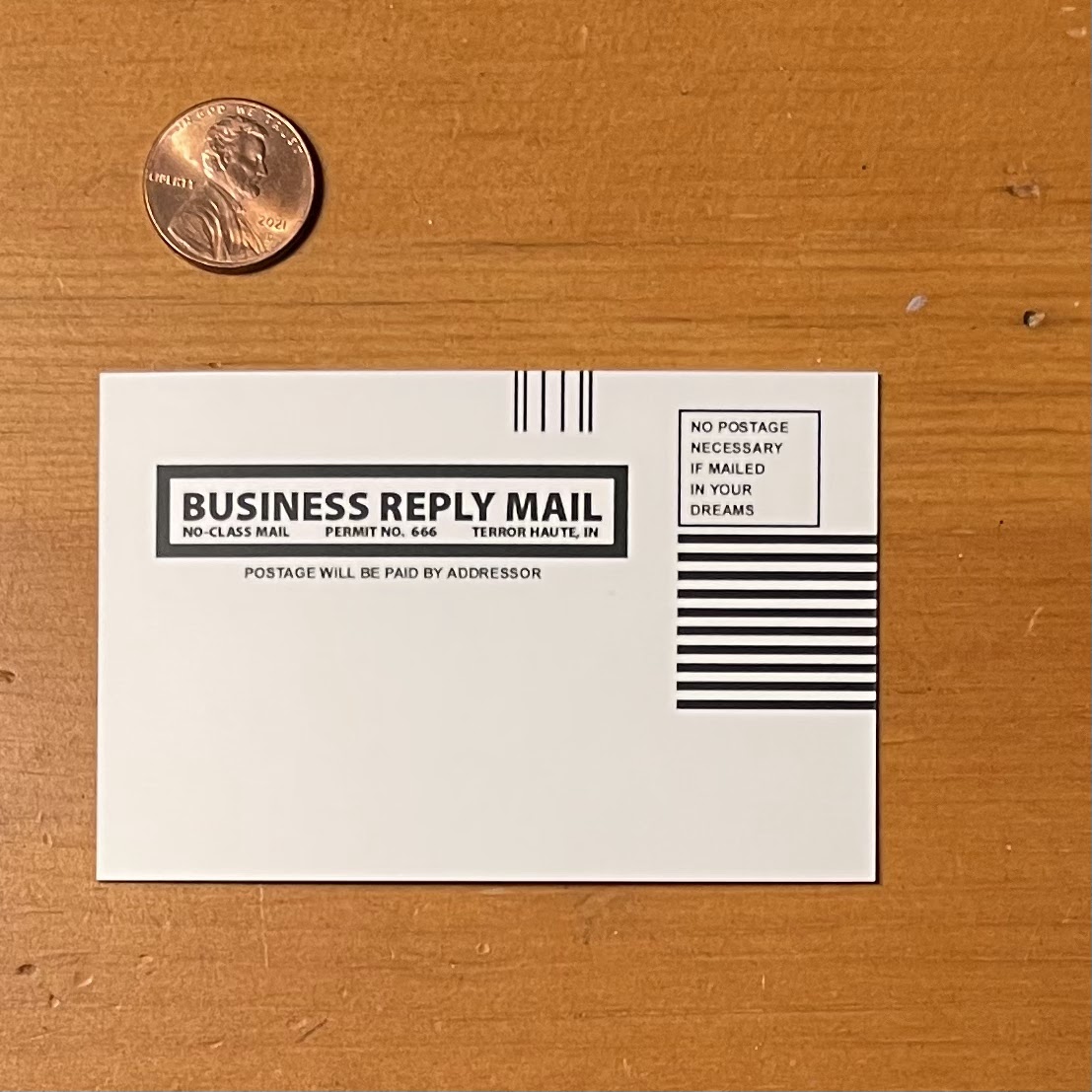
| A typical insert for the franchises' 'club' recruitment |
For those who never fell into the rather complicated web of ‘Columbia House’, allow me to explain (from memory) how it worked. They were a company that had leaflets or ads inside of popular magazines pandering to teens and young adults during this decade before the digital age completely decimated print media. You could almost always find a ‘Columbia House’ ad in any Rolling Stone, Spin, or other popular teen periodical. Columbia House’s approach was a slick devil’s bargain in disguise. Here’s how the soul selling deal went: For the price of a penny ($.01), they would send you several CD’s (Compact Discs), or Cassettes, of your choosing. The problem was as part of ‘membership’ fulfillment, you were obligated to purchase at least three CD’s/Cassettes at the full retail price. Sounds easy enough, until you realize that Compact Discs while only taking a few cents to make, were selling standardly at around $20-25 each. They were ridiculous expensive at the time before music had gone digital, which is why ‘mixed tapes’, or CD’s were so popular. The other issue was Columbia House would send you a mailer with a bunch of information, one piece being a notice that you were required to send back or you’d receive, and be billed for, their ‘Selection of the Month’. You could send the package back, but it was a hassle, and contacting the organization took an act of Congress (I should note here, that I did indeed speak with someone residing in Barbados, which outsourcing at the time was unusual, and not as much of a mainstream practice as it is today). Even if you completed your obligations, it was extremely difficult to leave their cult-like retailing. Keeping this in mind I took inspiration from the now mostly defunct company’s logo (I hear they still exist, but not in the same capacity. If you are interested about their untimely demise, their rise and fall is quite a fascinating read). The design process was simple and straightforward once I decided upon using the logo as my base for the piece. I located a good reference, vectored my image in Adobe Illustrator, and selected my Pantone colors for the manufacturer (Alchemy Merch would I have used for another gallery project). Considering I may be skirting copyright infringement territory with the design, I wanted to make sure to alter it. I went with the traditional 90’s defacement of things complete with red anarchist symbol that was so popular during those times. I deliberately ‘scratched off’ the ‘E’, leaving only the ‘H’, ‘U’, and ‘S’ visible. Along with the large ‘A’, it now read ‘HAUS’, and therefore gave the intended cynicism directed towards any language with lingering communist ties at the time. I added the extra words ‘sucks’, as it felt like the right thing to do for this piece, and the given era. During this timeframe it wasn’t uncommon to see logo’s, decals, pictures, communal books (text/library), all defaced with this type of ‘graffiti’ or vandalism. While it wasn’t harmless, it was also done on a much smaller, and lowkey scale, with an intent at levity. Satisfied with the design (and focus group passed), I sent the design off to the manufacturer, and began working on a backer that would properly showcase the pins. Unfortunately, the only design I could come up with was one based on the mailers from the magazines. Taking that as my template, I made a few adjustments in Adobe Illustrator with the verbiage and had them printed with MOO on 3.5” x 2.25” backers.
.jpg)
The soft enamel pin, (made from black nickel) itself is approximately 3/4" (H) x 1.35" (W), each one is bagged and mounted on a backer. The pin was designed entirely in Adobe Illustrator, with the pantone color selection process done in Adobe Photoshop. The backers were designed in Adobe Illustrator as well and printed by MOO. Alchemy Merch fabricated the mold, and their overseas affiliate fulfilled the final production requirements.


 This piece was made specifically for Gallery1988’s ‘The
90’s’ which ran from April 30th - May 8th, 2022, but it’s
inspiration should be obvious to anyone who came of age during that era. Hopefully it doesn’t provoke too many
memories of unsolicited deliveries, and collections notices. Please check the
gallery’s website for all available works related to show, including mine.
This piece was made specifically for Gallery1988’s ‘The
90’s’ which ran from April 30th - May 8th, 2022, but it’s
inspiration should be obvious to anyone who came of age during that era. Hopefully it doesn’t provoke too many
memories of unsolicited deliveries, and collections notices. Please check the
gallery’s website for all available works related to show, including mine.

For more information, or to see a catalog of my other work, please visit my online store here. You can also find me on various social media platforms below doing a multitude of other artistic things that include hand lettering, and the occasional sculpting, crafting, and painting.
Website: www.michaelstiles.com
Etsy: Stiles of Art
Threadless: mistiles
LinkedIN: Michael Stiles
IG: stiles1978
TikTok: stiles1978
Pinterest: Michael Stiles
Tumblr: stiles1978
Twitter: stiles_of_art
No comments:
Post a Comment