Monday, February 28, 2022

SLEEPWALKERS

This image was inspired by Gallery1988’s ‘30 Years Later:  Movies from 1992’. Now based on the title of this blog entry I think the ‘cat’ is out of the bag on which film I chose during this year. With that in mind, I did toy with the idea of doing a piece on some other favorites of mine from this era, like: Basic Instinct, Poison Ivy, Death Becomes Her, Raising Cain, or perhaps even Candyman. I love all those films, so they made my short list but when it came down to envisioning what I was going to be creating, Stephen King’s ‘Sleepwalkers’, spoke to me the loudest.

originally the centerpiece also featured the barn-like adjacent garage.

I set about locating the film (which I had to purchase, it came with Children of the Corn btw a steal IMO), and procuring reference for what I already had in mind. Thankfully this one came together instantly, and I was able to produce exactly what I had intended, which can be a real challenge. The piece is basically a narrative of the film which isn’t very complicated for a King story (the first of which was not based on an existing novel).


This was my original concept for the background behind the 'mist'.

Whenever I do works that are based on existing work, I try to find at least a few elements from the original, to connect it to the piece I’m working on.  In this case I knew that my imagery selection would differ enough from the original poster and cover design, that it would be easier to relate the works by sharing a color palette. Procreate has this awesome feature which allows you to take a photo or image and create a color palette from it.  Utilizing this feature, I began to select my main colors as I wanted this piece to stay rather monochromatic, or within the same color family.  I chose colors that I thought would contrast the most and set about working.  Initially I had a background that was more of a gradient, with a very hot pink at the top, and an indigo at the bottom.  Eventually I went for a solid look, and I even had some imagery I was planning on placing in the background subtly, but ultimately, it all competed too much with the main illustration.


For the layout of this piece I knew I wanted to have our female lead, ‘Tanya Robertson’ (played delicately by ‘Twin Peaks’ alumni Mädchen Amick), at the base of this dreamy nightmare.  Without giving away too much about the story, the ‘Sleepwalkers’ feed on the life essences of their target and draw it out of them through their mouths in the form of a purple-like light that looks like a mix between a beam and vapor.  I took some liberties with its portrayal here as it comes pouring from ‘Tanya’s’ beguiled lips.  I used this as a framing device, something I love to do with my work. It can be challenging, but my greatest feat in any work like this is the transformative nature, and fluidity of a story’s narrative. As I continued to form the image I had some space to work with, and determined that the house of dotting ‘Charles Brady’ (the dashing Brian Krause pre-Charmed), and his mother ‘Mary Brady’ (as played by the multi-talented Alice Krige). I originally drew the garage as well but I chose to edit it out so that I could increase the house’s size for legibility.  I also knew I needed to include the ‘Brady’s’ somewhere for context, as they do appear in the film quite frequently. Once I completed rendering the ‘Brady’s’, I set about including ‘Charles’’ sweet ride(s), and of course ‘Clovis’ to cap the piece.  There are also a few other elements, but I would recommend you watch the film, as explaining the nature would ruin some of the fun, but... 

WARNING: it features a lot of cats, and some violence against them, so if that’s not your thing, skip it.

With the illustration done, I needed to get it printed, and unfortunately, I did not have time to properly proof them.  I sent them off to my correspondent at SGX, and picked them up shortly after, as my deadline was quickly approaching. I’m still not entirely sure if the image is too dark or not, but I had to move on and overall I was pleased with it.


The 12” x 18” image was limited to a run of 11, on white pearl linen paper and featured as part of Gallery 1988’s ’30 Years Later: Movies from1992’. The show originally ran from March 19th, 2022- April 2nd, 2022. Please check the gallery’s website for all available works related to show, including mine.


For more information, or to see a catalog of my other work, please visit my online store here. You can also find me on various social media platforms below doing a multitude of other artistic things that include hand lettering, and the occasional sculpting, crafting or painting.


Website: www.michaelstiles.com

Etsy: Stiles of Art

Threadless: mistiles

LinkedIN: Michael Stiles

IG:  stiles1978

TikTok: stiles1978

Pinterest: Michael Stiles

Tumblr:  stiles1978

Twitter: stiles_of_art

Monday, February 21, 2022

SKETCH CARDS 4 (5x5)

Anyone who knows me, knows that I rarely if ever work traditionally anymore, but occasionally I make exceptions. In this case, that exception was Hero Complex Gallery’s ‘Sketch Cards 4’. The theme from the gallery was simple enough, and asked that we focus on pop culture related content.


          'Spider-Man', 5"x 5" Sketch Card

The gallery provided me the cards along with all the packing materials to return them, of course that was after I requested them (my bad). This would naturally put me behind schedule, as the cards arrived a few days later, and I was juggling multiple projects plus an upcoming convention.  With no shortage of work I had plenty to do while waiting for the cards to arrive. I received several of the standard 2.5” x 3.5” cards, and some of the larger 5” x 5”. I was immediately intimidated by the smaller cards so I put those away as I wasn’t even sure I’d be able to ever use them. I do like to work small, but I think the possibility of making a mistake weighed on me…not sure. I gathered the larger cards and began sketching some ideas on my iPad. For each image I provided a scene along with the character I chose.  I also selected the content with extreme personal prejudice, as these are still some of my favorite television characters. I felt that I was only doing fan service with the Spider-Man piece, the rest were all passion-projects for me.


'Milhouse Wigs-Out', 5" x 5" Sketch Card

Thankfully the sketches I did earlier helped me figure out most of the structure ahead of time, and I was able to quickly produce the images using tonal markers in lieu of color. I would have liked to use color but due to time constraints, it just wasn’t feasible. The cards were due on the 31st of December, and I somehow managed to get them out to the gallery on Christmas Eve (in a very empty Post Office), which was cutting it close. A theme of this month and several projects.


'Ralph Wiggum's Big Day', 5" x 5" Sketch Card

This was my first time working on sketch cards, and I enjoyed it overall.  Even if I didn’t follow directions. Apparently, if I would have read the email detailing the show, I would have known that the standard cards were for the show, not the 5” x 5” cards. Those were for  ‘5” x 5” Fridays’, a feature the gallery was looking to highlight. I was deeply embarrassed, and the gallery was very gracious about it. Thankfully I would have another opportunity, as the cards came with an insert detailing the next show which in August of 2022.


'Zim fails to remember Phase 2', 5" x 5" Sketch Card

I started these sketch cards sometime in the middle of December 2021, and completed them on December 24th, 2021, spending varying amounts of time on each illustration. Overall, I’d say each card took me anywhere between two, to three hours, with perhaps one or more taking me a bit longer (like that damned leprechaun on Ralph’s shoulder). The cards were due on December 31st, 2021, with the show opening on February 26th, 2021. All the sketch cards measure in at 5” x 5”, and are all one of a kind, exclusively available at Hero Complex Gallery. Please check the gallery’s website for availability, and any other remaining works related to the show including mine.


'Taco Tuesday's with G.I.R.', 5" x 5" Sketch Card

For more information, or to see a catalog of my other work, please visit my online store here. You can also find me on various social media platforms below doing a multitude of other artistic things that include hand lettering, and the occasional sculpting, crafting or painting. 

UPDATE: Much to my surprise, most of the cards sold rather quickly, so you’ll simply have to bask in their glory here virtually.


Website: www.michaelstiles.com

Etsy: Stiles of Art

Threadless: mistiles

LinkedIN: Michael Stiles

IG:  stiles1978

TikTok: stiles1978

Pinterest: Michael Stiles

Tumblr:  stiles1978

Twitter: stiles_of_art

Wednesday, January 26, 2022

OZARK™️

This piece was designed specifically for an exhibition curated by Gallery1988 for the Netflix series of the same name. When I initially received an invitation (in May of 2021) to participate, I knew very little about the franchise, and I had only ‘heard’, or ‘seen’ the show advertised on the platform. It was in my que, but, so is a lot of stuff, and I rarely watch scripted television, especially when the material is this dense.  I was also unaware it was going to be in conjunction with the production companies (Striker Entertainment & MRC) to promote the upcoming series finale (this is important).

Original sketch for OZARK™️ mug wrap 4" x 8.5"

I scheduled the piece in my calendar and began working on an unrelated illustration for an upcoming show, as the ‘OZARK’ exhibition wasn’t scheduled until March 2022. I thought I would have time to watch the series over the next several months and get a feel for it. That is until I received an email with show guidelines in July (2021), and a deadline of ‘initial sketches’ for approval on August 1st.


panel 1: featuring 'The Blue Cat Lodge', Water Tower, 'Lickety Splitz', lakeside offices, and the 'Byrdes' home.

I’ll give you a minute to digest that.


panel 2: Water tower, 'Missouri Belle', Mason Young's lakeside service, and Sue's home.

What this really meant was, whatever I was working on, would need to be put aside for the moment. I then began doing what I told myself I would never do in my adult life.  I binged watched Netflix, and I liked it. There I said it. It was liberating to do nothing but watch episode after episode of the RIDICULOUSLY twisted nature of ‘OZARK’ (the show not the place…at least as far as I know). Bleary-eyed and in much needed of sunlight and movement, I somehow managed to crank out a sketch based on the concept of a mug wrap which I have done previously for the gallery. The show itself is impossible to nail down (in my opinion), since there is just entirely too much inspiration to draw from. From the cast, the setting, to even the color scheme of the show. Initially, I thought about doing a souvenir mug for the ‘Missouri Belle Casino’, but realized that the show really is an ensemble. Instead, I opted for a landscape layout, and attempted to include all the major environments from the shows first three seasons which are littered like ‘Easter Eggs’ all throughout the piece. Upon completion, I did a ‘clean’ draw-over, and labeled it for the producers as the image was realistically going to be very small. I then sent the drawing to my liaison, along with an unnecessarily detailed email explaining everything including links to examples of previous mug wraps I had done in the past.  I basically treated it like I was applying for a job, afterall if the producers rejected the work, I was not going to be able to participate in the show.


panel 3: the Langmore's trailers, and the Snell's home.

A few months later in October (2021), I received my approval from the gallery (after a minor adjustment…apparently my reference for the casino said ‘Mississippi Belle’, and should have read ‘Missouri Belle’, my bad). The next step was a full color approval due on December 1st (2021). Truth be told, the draw over I did which was submitted for approval, was the final image. When creating the piece I worked on it in full color.  I wasn’t married to the color selections so I did the draw over to give the producers some opportunity for input regarding values. With their blessing (and no color preference), I took the piece into Adobe Illustrator and vectored out all of the different images. The trees, and water ripples were drawn in Procreate, along with some editing done in Adobe Photoshop (primarily color and scale). I then proofed the image (thankfully only twice) and submitted it by the deadline.


Shortly afterwards into the New Year (2022), I heard back from the gallery with approval for the final piece. With production delays being what they are/were at this time, I immediately ordered a prototype mug from my supplier.  I wanted to see the quality, and how long it was going to take them to ship it. Luckily, the transfer was beautiful and it arrived faster than I expected. With the show deadline quickly approaching, I ordered several for the event, and had them shipped directly to the gallery.  

Featured exclusively at Gallery 1988’s “OZARK Art Exhibit” which ran from March 4th, 2022, to March 12th, 2022, the 15oz. mugs were limited to a run of nineteen (twelve of which went to the producers, and the remaining to the gallery). For more information please check the gallery’s website concerning all available works related to show, including mine.


For more information, or to see a catalog of my other work, please visit my online store here.  You can also find me on various social media platforms below doing a multitude of other artistic things that include hand lettering, and the occasional sculpting, crafting or painting.


Website: www.michaelstiles.com

Etsy: Stiles of Art

Threadless: mistiles

LinkedIN: Michael Stiles

IG:  stiles1978

TikTok: stiles1978

Pinterest: Michael Stiles

Tumblr:  stiles1978

Twitter: stiles_of_art


Friday, January 21, 2022

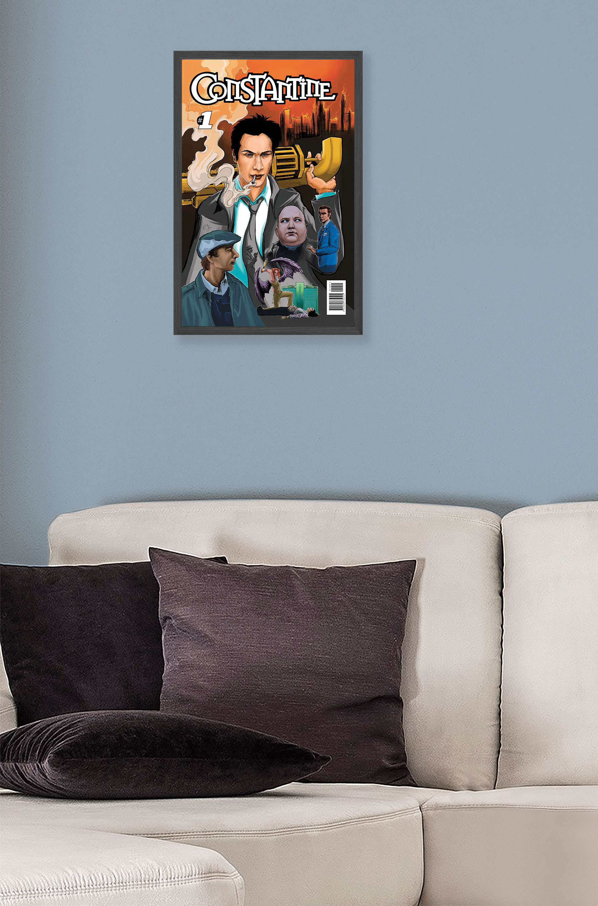
CONSTANTINE

In late November (29th), of 2021 I received an email from Hero Complex Gallery inviting me to participate in their upcoming ‘Covers’ group show. At first, I wasn’t sure I would be able to participate. I had several other obligations including two conventions, and two other gallery shows. It was a tight fit for sure, but I managed to squeeze the project in quickly.  Its development is another story…

As December was coming to a close I had yet to start the project for this show, nor did I accept participation yet.  I wanted to make sure I didn’t overwhelm myself, and I also had no idea what to create.  The concept was amazing, as were the examples the gallery provided, however it was also very broad. Initially, I was going to base the project around either a popular song, or movie but while brainstorming I recalled a conversation from the comic convention I exhibited at earlier in month.  At the event, my neighbor Mark (of Lesser Known Comics), spoke with me briefly, and I recall expressing interest in illustrating covers. It dawned on me then, that I should merge those two concepts, and showcase my talents. Create the job you want, right? Something like that…

I quickly picked 2005’s adaptation of DC and Vertigo ComicsConstantine” starring Keanu Reeves, and Rachel Weisz.  The movie also stars some other lesser knowns like Academy Award Winner Tilda Swinton, Disney kid Shia LeBeouf, Marvel’s Djimon Hounsou, and some guy named Gavin Rossdale who was in an obscure band called ‘Bush’. I kid, because those stars are HUGE.  The movie is pretty damn good too.  I’m not a purist (I read Marvel), so I have no idea if it follows the storylines from any of the books, but I immediately became a fan of the character, and not just the movie (#MattRyan).


With the due date quickly approaching (January 21st, 2022), I set to work on the piece.  I developed the image entirely in my iPad in Procreate using the Sketching 6B brush. I had settled on a layout quickly, with ‘John (Constantine)’ being central, and using his trench coat as a framing device to contain the numerous characters we meet along his journey.  After some initial sketching of where I was going to place my images I began collecting reference, and rewatched the film a handful of times.  I wanted to capture the film properly so I often review a movie, or series multiple times before I ever finish a piece. I look for what ‘speaks’ to me, and determine then, or on a repeat viewing, what I want to include in order to represent the narrative accurately. It’s an oddly enjoyable process, which maybe sound terrible to others, but most of the selections I make are rooted in personal preference. 

Having collected my imagery I was ready to start working on my renderings.  I decided that this piece, in part to its rapidly approaching due date, was going to be slightly experimental. I was going to pencil render (digitally), all the vignettes, and add minimal color afterwards. Most of the renderings came along quickly, with a few (‘Chas Kramer’/Shia & ‘Papa Midnite’/Djimon), giving me an exceptional amount of trouble. Resolving what I could, I moved on to the color process and made some final adjustments in Adobe Photoshop (scale/placement/color, as I would learn early on making scale adjustments specifically in Procreate is a bad idea as the device ruins the crispness of your line work).  I also vectored the title font in illustrator along with all the other ‘comic book’ cover ‘elements’ (barcode and issue number).  I was asked to include ‘Easter Eggs’ in the piece if possible, and there are a few, some more obvious than others. Take a close look at the piece, you never know what you might discover.


Upon completing the illustration, I sent it to SGX for proofing. Since the due date was so close (January 21st, 2022), I ended opting for the gallery to print the image on demand, as well as select the edition limits for it. Originally the piece was scaled to an aspect ratio of a standard comic book (6.88”x 10.5”) however the gallery pointed out that it would most likely perform better at a more traditional size. This made sense, and I’m not entirely sure what I was thinking as ultimately it was going to be sold as an image, not a book so the size didn’t need to be authentic. I had to make several adjustments to the file, before I was able to get Hero Complex Gallery a version that they could use. It was a bit more complicated than I expected, and the number of uploads it took to correct the issues is embarrassing. Live and learn I suppose. 


The final piece is 11” x 17” and exclusively featured at Hero Complex Gallery’s “Covers (2022)” which opened online May 14th, 2022.  Please check the gallery’s website for all available works related to show, including mine.


For more information, or to see a catalog of my other work, please visit my online store here. You can also find me on various social media platforms below doing a multitude of other artistic things that include hand lettering, and the occasional sculpting/crafting or painting. 


Website: www.michaelstiles.com

Etsy: Stiles of Art

Threadless: mistiles

LinkedIN: Michael Stiles

IG:  stiles1978

TikTok: stiles1978

Pinterest: Michael Stiles

Tumblr:  stiles1978

Twitter: stiles_of_art