Saturday, December 9, 2023

Cat Nap

This piece was inspired by Gallery1988’s ‘Off The Leash’ group show, dedicated to the (in)famous pets of pop culture. Initially the gallery sent us a list of loveable companions to choose from, but I didn’t see some of my favorites, so I asked for permission to pick an alternative one. Originally I was going to illustrate ‘Ein’ from ‘Cowboy Bepop’, but seeing as how over saturated the world is with Corgi artwork, I determined a different path was preferable. Instead, I went with the furry felines from the ‘Sailor Moon’ series: Luna, Artemis, and Diana.


My first pass at the piece, it included a reference to each season which was too ambitious, and off topic.

This piece went through a few layouts, until I finally landed on the one you see here. My original concept was to do a scene of ‘Usagi’s’ bedroom with the cats in various locations, along with Easter eggs littered about to represent the various seasons of the television series I was familiar with.

This proved to be incredibly difficult, and the further I got along with the image, the less it was about the cats, and the more it became about showcasing different elements from the series.

Eventually I scrapped the layout, and decided I needed a close-up of the cats instead, laying on ‘Usagi’s’ bed. I went about collecting image reference for the cats, and stumbled up a perfect layout of three cats sleeping together. The only problem was I needed a kitten to replace one of the adults in the image to complete my layout.

I would go through two different design options for Diana, before I was able to find a position, and image reference that I could work into the layout.

While Luna, and Artemis took me a fraction of the time Diana did, I was finally able to get my layout finalized.

I then set about cleaning up the image in Procreate (where I started the piece during the ‘sketching’ process). 


My second pass, which was still too focused on 'Sailor Moon', and less the furry feline companions.
 

I then exported the image into Adobe Photoshop where I would adjust the layout and the scale of the cats, until I was satisfied. Next I exported the image back to Procreate, where I began the painting process.

Animal fur is not my forte, and I spent a painstakingly long amount of time trying to get the lighting correct. During this phase I spent a lot of time trying to find good lighting reference, and even tried recruiting my own cat (to no avail…cats aren’t great models, or at least mine wasn’t).

After several long hours, I finally finished painting the image, and then took it into Photoshop to adjust the lighting as it was looking entirely too dark. This took me a few hours, and eventually I had something I felt was ready to print.


Incomplete sketch of Luna laying on top of Artemis.


I then sent the image to the printer for my initial proofing and had them produce two different versions (on different papers).


Sketch of Diana, Artemis and Luna's kitten.

I started the piece on October 30th, 2023 and finished it on December 9th, 2023. The initial sketching process took me approximately thirty nine (39) hours, and thirty three (33) minutes with the painting process taking me an additional sixty eight (68) hours, and sixteen (16) minutes, with another one (1) hour cleaning up the image, and three (3) hours in Photoshop editing it, for a grand total of one hundred seven (107) hours, and forty nine (49) minutes. 


Sketch of all three cats (Artemis, Diana, Luna), atop Usagi's bed.

The 14” x 11” image (printed on 100lb Cover, thank you SGX), was made for Gallery1988’s ‘Off The Leash’, a group show dedicated to the beloved ‘pets’ of film and television which opened January 26th, 2024 through February 10th, 2024 (online). At this time the prints are exclusively available via the gallery, so please check their website for all remaining works related to the show including mine.


Final full colored image of the three feline companions (Artemis, Diana, and Luna), from 'Sailor Moon'.

For more information, or to see a catalog of my other work, please visit my online store here.

You can also find me on various social media platforms below doing a multitude of other artistic things that include hand lettering, and the occasional sculpting, crafting or painting.


Final 14" X 11" image on 100lb cover.

Website: www.michaelstiles.com

Etsy: Stiles of Art

Threadless: mistiles

LinkedIN: Michael Stiles

IG:  stiles1978

TikTok: stiles1978

Pinterest: Michael Stiles

Tumblr:  stiles1978

Twitter: stiles_of_art

Sugar Water

For my first show of the 2024 year, it was going to be a double feature, starting with Gallery1988’s ‘Art of the Music Video’ group show. The premise was an interesting one, and I have to give credit to the gallery for always managing to challenge me creatively. They did however send a list of some memorable videos that was helpful, but I wanted to do a more deep dive on this particular subject.

One of the many passes at free-handing the font.

The list did contain some of my own personal favorites, as I had come of age during the Golden Age of Music Television, having witnessed its dawn, and its lamentable metamorphosis into the reality television programming station it has become. Sadly, I was ‘that kid’, who ran home after school to catch the latest music video release by whatever media titan currently ruled the airwaves (be it Madonna’s ‘Vogue’, or M.J.’s ‘Black Or White’). Also, while I may be reminiscing, you’d be shocked at the list of directors for some of these music videos. Many among them now incredibly famous, and at least one Academy Award winner.

Yeah.

Crazy.


Curlz font used as a base for the ambigram's text.

With that all said I had some skin in the game on this one, so I wanted it to be…special, but also relevant. I made a list of the videos I could recall, and then took to the internet to do some test marketing. I asked my survey group what their favorite or most memorable music videos were from back when they were actually televised on MTV or VH1. Most of the responses were on the list, with a few that confirmed some of the ones I had on my own list. After gathering all my ‘contenders’, I brainstormed a bit, and then decided what work best given my time constraints (double booking), and personal tastes.

I decided that since the show was based around how memorable the video was, versus the song (which I was more married to), I went with Cibo Matto’s ‘Sugar Water’ video directed by (Academy Award winner) Michel Gondry. I recall seeing this video once, very early in the morning after an evening out, and also thinking it was a fever dream considering I would never see it again for many years (live television being what it was and YouTube not existing and all). The memory stuck with me, and personally it was/and is, the most memorable music video I think I have ever seen. Sure, there are plenty others, but this one was extremely clever, and creative. That I could appreciate.

At this junction, I would encourage you to watch the very short four-minute music video he made in order to truly appreciate this piece I did, because otherwise it really won’t carry much relevancy moving forward as there are far too many references in the piece.


Oh, back already?


Wild, right?

So basically the video is what I have seen referred to as a one-shot, in which there is one continuous loop of footage without interruption. In the masterfully shot video, Gondry takes us through the lives of the two band members as they meet, and return from whence they arrived. The song itself lends such a dreamy vibe that it’s an almost seamless experience.

It’s worth rewatching, as there are multiple Easter Eggs to find on each side of the split screen during the cause and effect events that transpire. I myself did so, and gathered as much visual reference as I could before I began illustrating my piece paying homage to Gondry’s skillful cut. 


One of the many motifs I pulled from the music video.
 

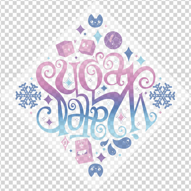
I determined early on that no matter what it was that I made, my image would need to be reversible. I do work a lot with typography, so typically for my gallery shows, I avoid using it. For this project however it seemed like it might be worth incorporating. I decided instead of illustrating something incredibly detailed, I could instead make it more fun. I had to do a little more research given my requirements, but discovered that I could create an ambigram, or a calligraphic composition of glyphs (letters) that can read more than one way given the orientation.

Ya’ dig?

I chose the song’s title for my ambigram, and began by sketching out my composition, and how I wanted it flow. After some time, I developed the design entirely on my iPad in Procreate, but I wasn’t happy with the outcome. I then went into Adobe Illustrator, and decided that I needed to pick a font instead of trying to do this myself. Given the vibe of the song, and the background of the band, I knew I wanted the font to be lively, but also playful. After a bit of testing I selected a font called Curlz MT as the basis of my design. I then configured the layout in Illustrator using the type, and took it back into Procreate to manipulate by hand.

After some time I had the initial look of my ambigram, and moved on to filling the empty surround space of the composition with fun kawaii-esque inspired illustrations from the music video.

There are several littered about the perimeter of the piece and even repeated a few of them throughout the piece.

Upon completing the illustrations, I decided I was still not satisfied with some of the elements I had here.

First the snowflake wasn’t working for me, so I redesigned that.

Next I took the ambigram into Illustrator and vectored the lettering. It was incredibly time consuming, and I wasn’t even sure it was going to be worth the effort, but thankfully it turned out to be exactly what I needed to do.

Having completed the outline, and I adjusted the line work to smooth out my lines, and readjust any details I had added when I was working by hand.

With that done, I took the image into Adobe Photoshop, and began rebuilding my layout with my clean images.

Seeing as this piece is rather simplistic in design, I took more time with the compositon, adjusting, and moving multiple items in order to get everything to ‘fit’.


Final image of the ambigram orientated with Sugar at the 'top' of the image.
Final image of the ambigram orientated with Sugar at the 'top' of the reversible image.

Upon completing my layout, I then took the image back into Procreate to add color which would essentially be me using an overlay or screen of color, along with some textures to give the image a more ‘handmade’ feel.

While experimenting, I opted out of adding any textures, and decided instead to see if printing it on textured paper would be a better option.


I started the piece on October 16th, 2023 and finished it on October 29th, 2023*. The initial sketching process took me approximately twenty eight (28) hours, and forty-seven (47) minutes with the painting process taking me an additional one (1) hours, and sixteen (16) minutes, for a grand total of forty one (41) hours, and three (3) minutes (this includes three [3] hours spent in Photoshop, and eight [8] hours spent in Illustrator). 

*I would pause here and return to paint it on December 9th, 2023. I was working on both this project and my piece for their ‘Creatures’ exhibit as well, both of which open the same day.


Final image orientated with Water at the 'top' of the reversible image.
Final image of the ambigram with Water at the 'top' of the reversible image.

The 10” x 10” image (printed on White Pearl Linen, thank you SGX), was made for Gallery1988’s ‘Art of the Music Video’, a group show dedicated to a the golden era of MTV, which opened online January 26th, 2024 and ran until February 10th, 2024. At this time the prints are exclusively available via the gallery, so please check their website for all remaining works related to the show including mine.

Final 10" x 10" image on white pearl linen.

For more information, or to see a catalog of my other work, please visit my online store here.

You can also find me on various social media platforms below doing a multitude of other artistic things that include hand lettering, and the occasional sculpting, crafting or painting.


Website: www.michaelstiles.com

Etsy: Stiles of Art

Threadless: mistiles

LinkedIN: Michael Stiles

IG:  stiles1978

TikTok: stiles1978

Pinterest: Michael Stiles

Tumblr:  stiles1978

Twitter: stiles_of_art